

A note from Laurie
This week’s scripts explain why a finished room looks right, and how much thinking goes into getting it there. Groups of three, mixed patterns, curtains that puddle, a marble wall that mirrors itself, and the dining chair that has to survive a three-hour dinner. We also have three brand spotlights: Loloi on how a handcrafted rug gets made, Taylor King on custom upholstery, and Leftbank Art on finding the right piece for a specific wall. If you only have time to film two, start with The Chair Test and Why Designers Use Sightlines, because both show clients the kind of thinking they never see but always benefit from.
Ten fresh scripts below. Tap any title to open it. Everyone picks different ones, so your videos stay uniquely yours. Choose the two that best fit your voice and your clients, film them, and tag #idcvideo and @interiordesigncommunity when you post.
Filming tip: Turn on your camera’s grid lines before you record (iPhone: Settings > Camera > Grid. Android: the gear icon in your camera app). Line your eyes up with the top line. It keeps you from floating too low in the frame or cutting off the top of your head.
1. The Rule of Three
Hook: Can we talk about why THREE things on a table almost always look better than two or four?
If you’re working on decorating your room let me give you something to think about. There’s actually a reason designers keep coming back to groups of three.
It’s literally called the Rule of Three and once you know it you’re going to start seeing it EVERYWHERE.

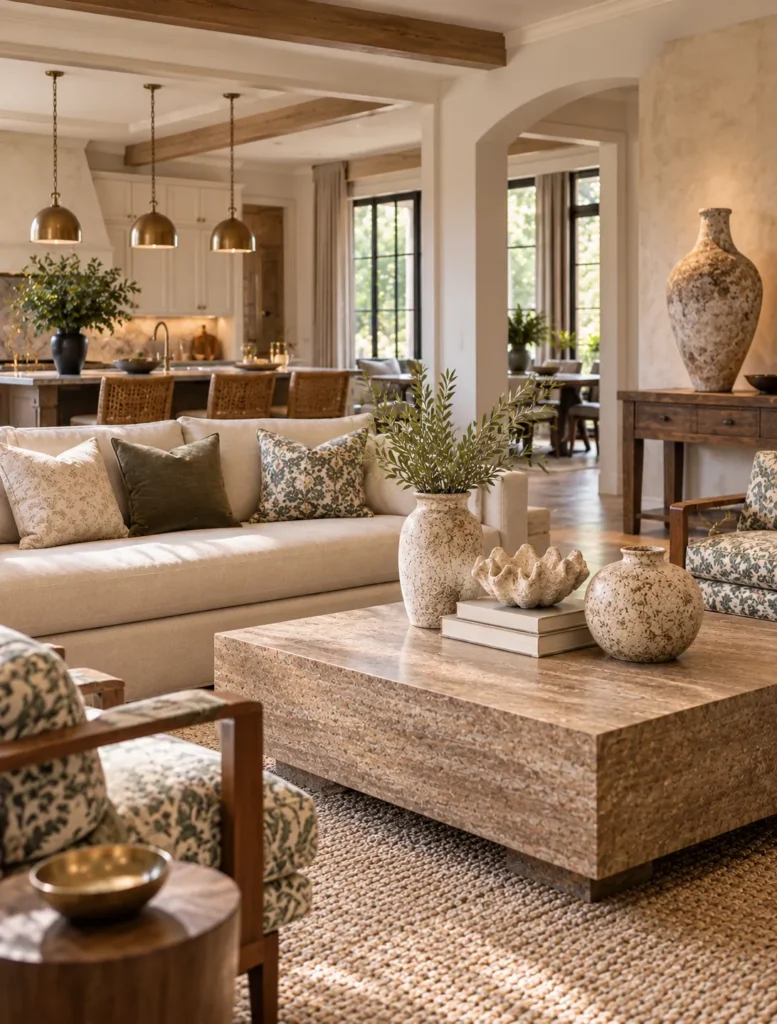
Three pillows on a sofa.
Three objects on a coffee table.
Three pendants over an island.
Why?
Odd numbered groupings tend to make your eye MOVE.
With two identical objects your brain wants to pair them up. It sees symmetry, processes it, and moves on.
But add a third object and suddenly there’s more visual movement.
Now this does NOT mean I want you running around your house putting everything into little groups of three.
Because the real trick isn’t just the NUMBER.
It’s what we’re doing WITH those three things.
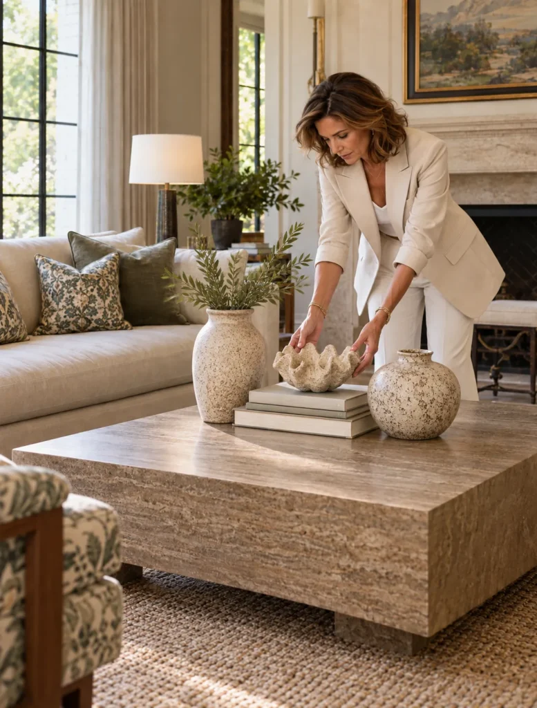
On a coffee table I might use something tall, something lower, and something with an interesting shape.
Maybe it’s a vase, a stack of books, and a sculptural object.
They’re three completely different things but together they create a composition.
And we can play with scale, height, texture, color, and even the amount of space BETWEEN them.
The same idea works on a larger scale too.
Three pieces of art.
Three lights.
Three different materials repeated throughout a room.
But here’s where designers break our own rules.
Sometimes TWO is exactly right.
Sometimes FIVE works better.
And sometimes ONE incredible object is all a space needs.
The Rule of Three isn’t really a rule.
It’s a really good place to START.
And knowing WHY it works also helps you know when to completely ignore it.
Caption
Three just has a way of looking RIGHT 👀
The Rule of Three is one of those design tricks you probably use without even realizing it. But like most design “rules”…sometimes knowing when to break it is the best part.
Do you use the Rule of Three in your designs?
#interiordesigncommunity #interiordesign #designtips #interiordesigner
Assets
Press and hold any image on your phone to save it to your camera roll.
2. Why Designers Mix Patterns
Hook: Why can a designer put FIVE patterns in one room and somehow they don’t fight with each other?
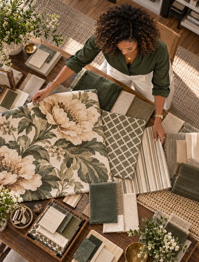
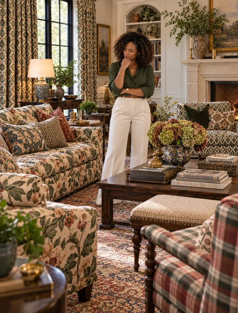
Because mixing patterns is NOT just throwing a floral, stripe, plaid, and geometric into a room and hoping everybody gets along.
There’s actually a relationship happening between them.
One of the first things I’m looking at is SCALE.
If every pattern is roughly the same size they all start competing for your attention.
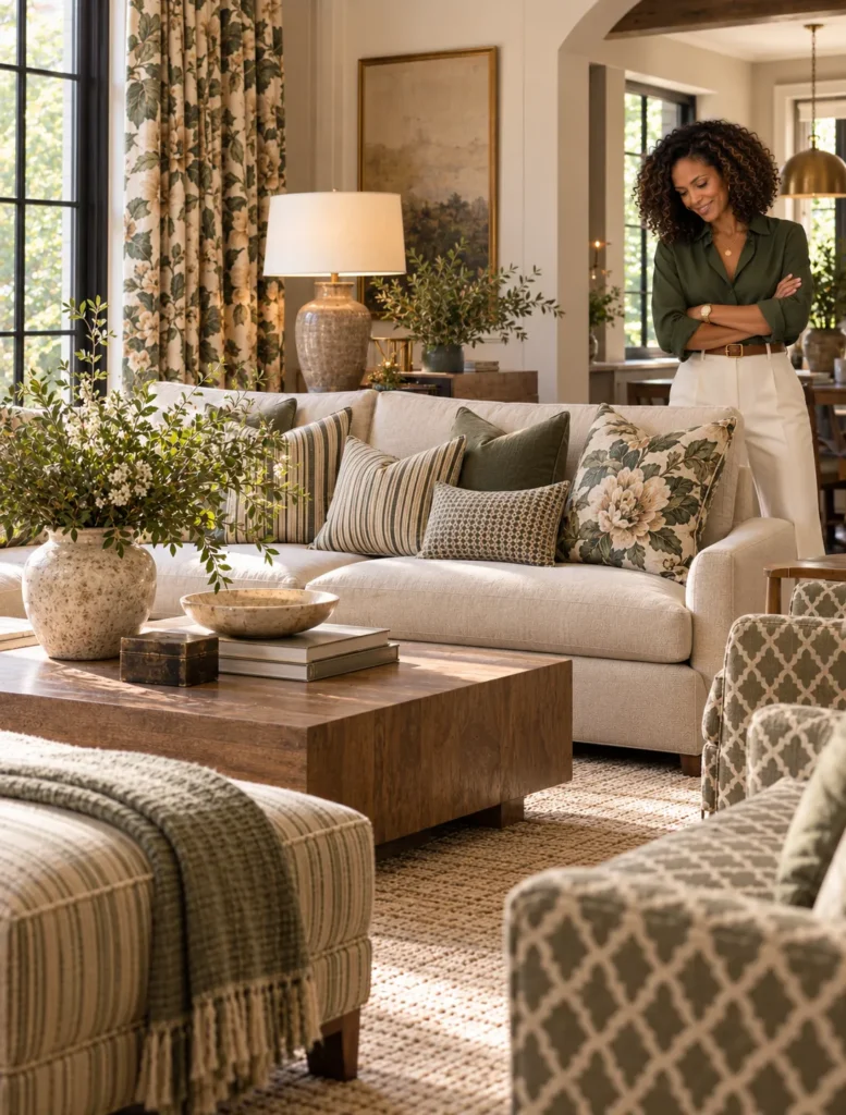
So maybe I have one large scale floral, a medium geometric, and then a much smaller stripe.
Now your eye knows where to go.
But scale is only part of it.
We also need some connection between those patterns.
Maybe they’re pulling from the same color palette.
Maybe one fabric contains several colors that show up individually in the others.
Maybe the patterns are completely different but they share the same visual energy.
And then we need somewhere for your eyeballs to REST.
Not every surface in the room needs to audition for the lead role.
We might use solids, textures, quieter materials, or negative space between those patterns so the room doesn’t become visual chaos.
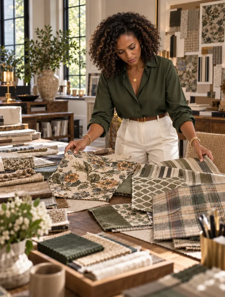
This is also why designers order samples and lay materials out together.
Because I can love five fabrics INDIVIDUALLY and absolutely hate what happens when I put them next to each other.
Pattern mixing is really about creating relationships.
Different scales.
Different rhythms.
Enough connection that they belong together.
And enough contrast that the room doesn’t look like we bought 14 yards of one fabric and panicked.
THAT’S when mixing patterns starts looking intentional instead of accidental.
Caption
Mixing patterns is basically a very carefully managed group chat 😂 Everybody gets to have a personality but they cannot ALL be talking at once. Scale, color, rhythm and a little breathing room are what keep the whole thing together.
Are you a pattern mixer or does this make you nervous?!
@interiordesigncommunity #idcvideo #patternmixing #interiordesign #designtips
Assets
Press and hold any image on your phone to save it to your camera roll.
3. What Makes Loloi Different? · Loloi
Hook: A rug can take MONTHS to make and the part you eventually walk on starts with somebody preparing individual fibers.
THAT is something I think we forget when we’re looking at a finished rug.
We see a pattern, a color, and a size.
But there can be an entire craft story underneath it.
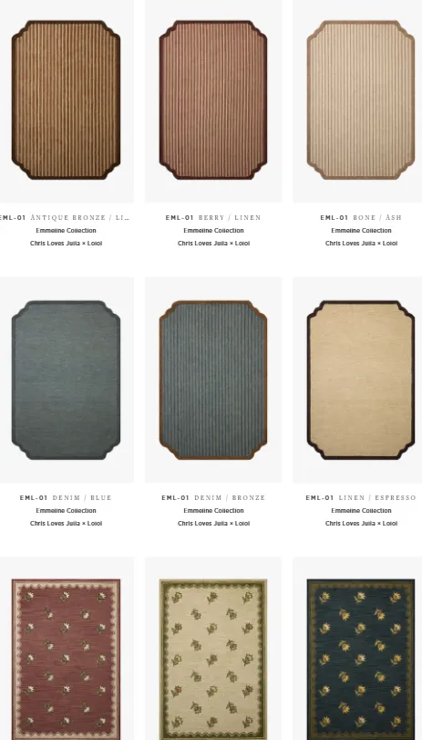
Loloi was founded by Amir Loloi about 20 years ago and one thing I find really interesting is how much of their rug story still goes back to traditional rug making techniques.
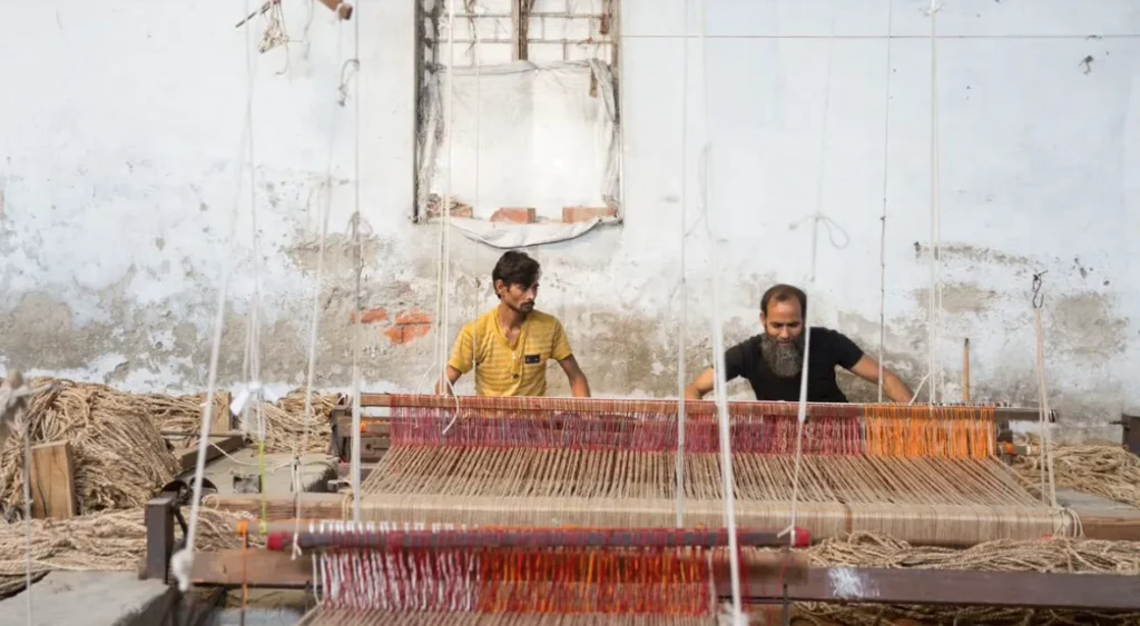
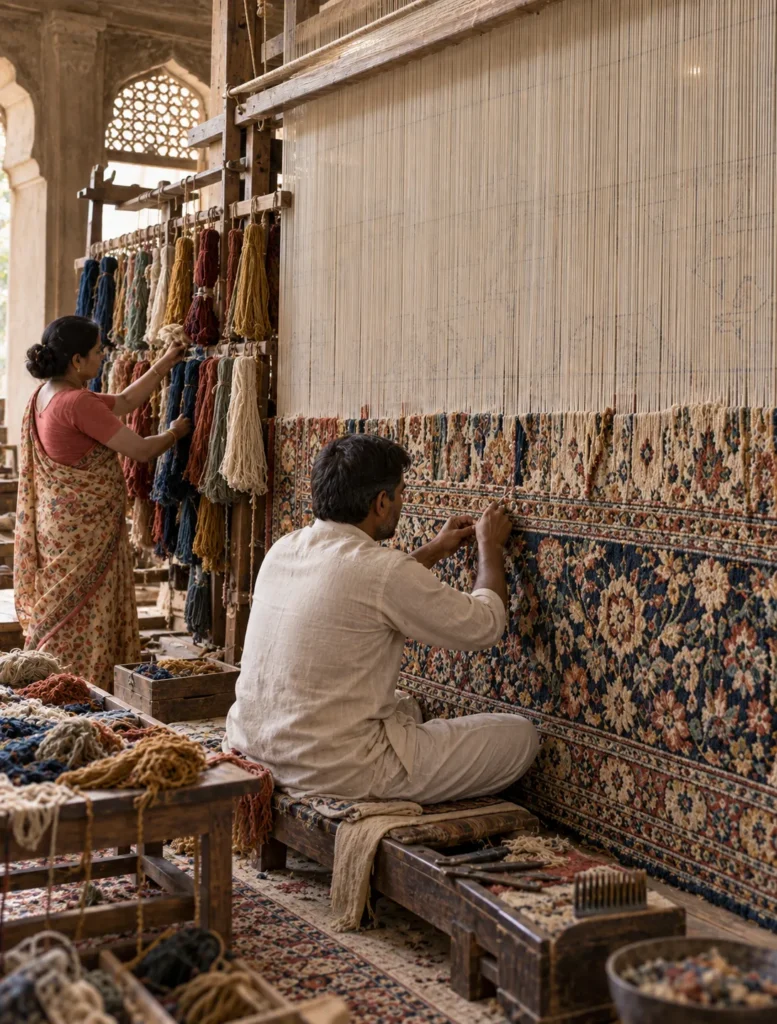
For their handcrafted rugs made in India that process can begin with preparing the fiber.
Then yarn has to be dyed.
And depending on the construction artisans may knot the rug by hand before the surface itself is hand-finished.
Think about that for a second.
We are eventually going to put a coffee table on this thing and walk across it in our socks but somebody had to think about the fiber, dye, weave, texture, pattern, AND finishing before it ever became the rug we’re looking at.
And those details matter when we’re specifying rugs.
Because designers aren’t only asking, “Is this pretty?”
We’re looking at construction.
Fiber.
Pile.
Texture.
How it’s going to feel underfoot.
Where it’s going in the house.
How much traffic that room gets.
How the colors work with every OTHER material we’ve already selected.
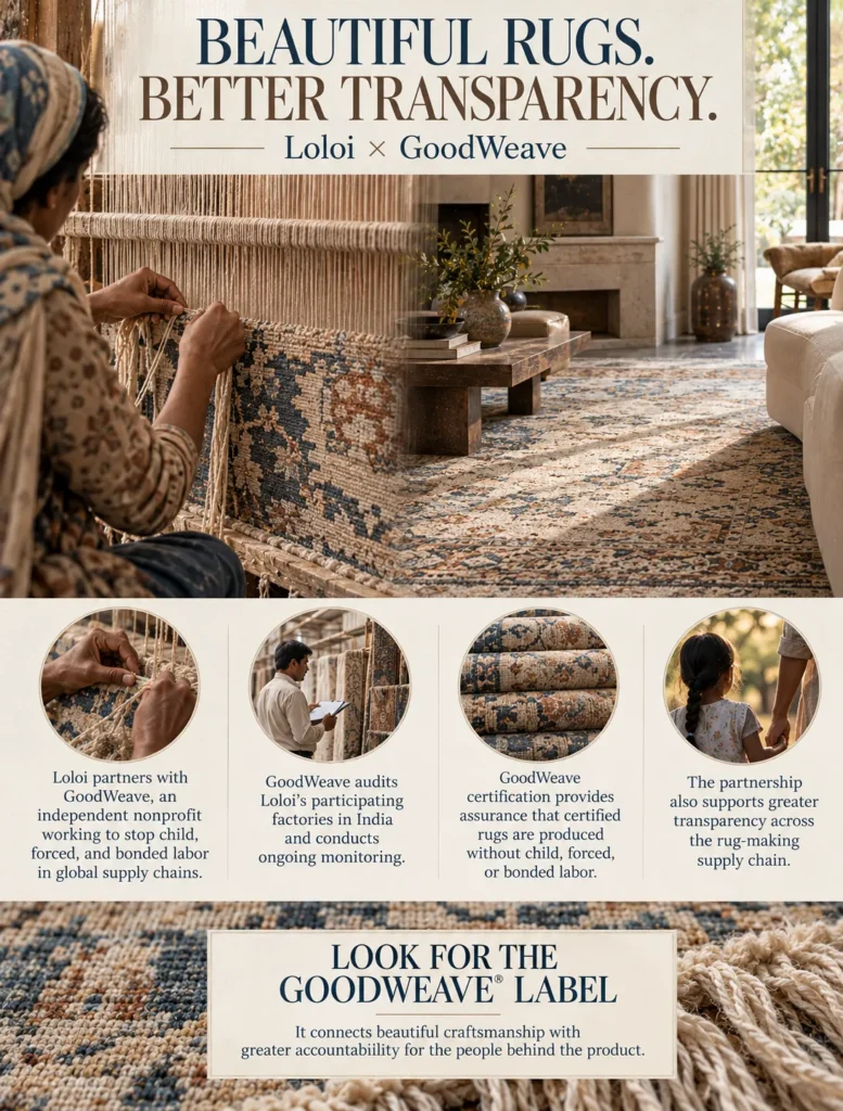
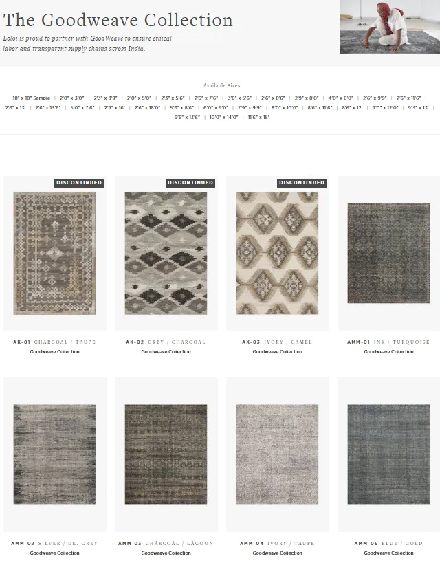
Loloi also works with GoodWeave which is a great company that audits factories in India for child, forced, and bonded labor.
And I think knowing HOW the things we put into people’s homes are actually made makes us much more thoughtful specifiers.
A rug might be the foundation of the room visually.
But there can be a whole lot happening underneath that pretty pattern before it ever reaches your floor.
Caption
We walk on rugs EVERY day without thinking about how much can happen before one ever reaches the floor. Fiber preparation, dyeing, weaving, knotting, finishing…there is an entire craft behind the finished piece.
Loloi works with traditional rug making techniques AND partners with GoodWeave, which audits its factories in India. THIS is the kind of information I love designers and consumers knowing about the products going into their homes.
@loloirugs @interiordesigncommunity #idcvideo #loloi #rugdesign #interiordesign
Assets
Press and hold any image on your phone to save it to your camera roll.
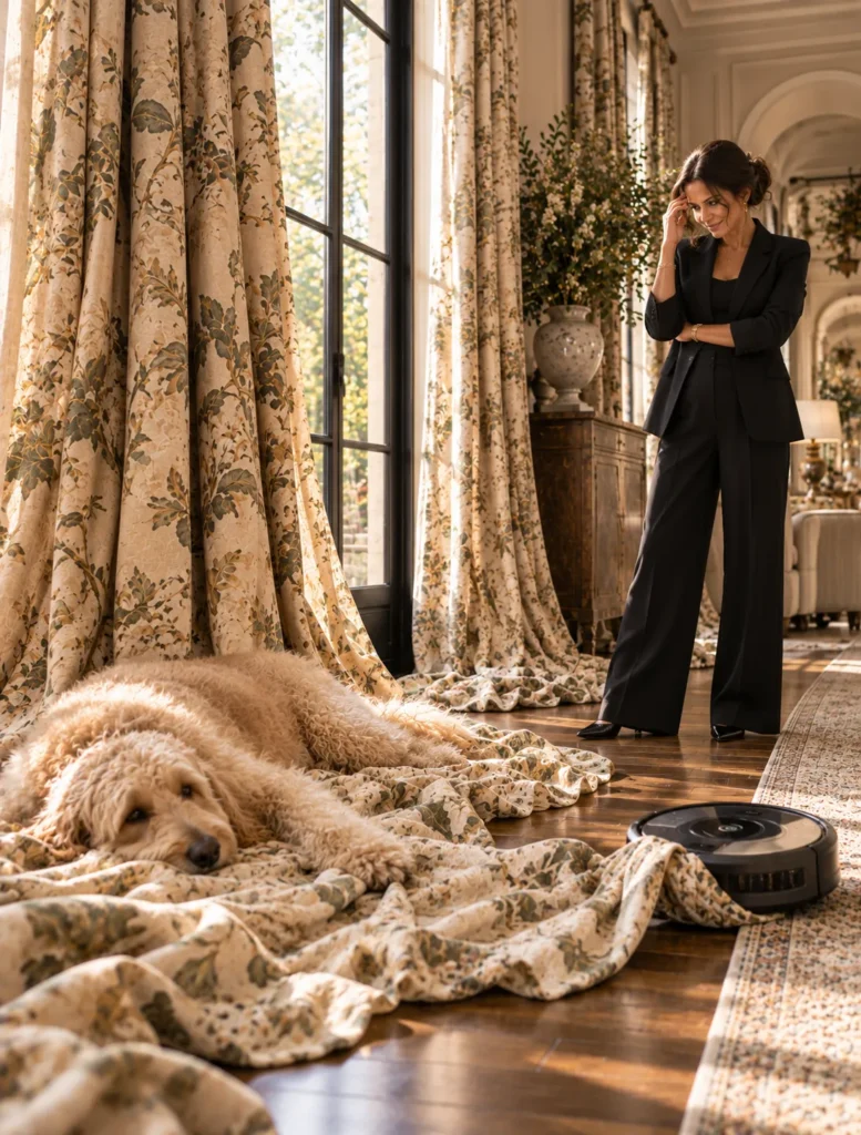
4. The Curtain Puddle Debate
Hook: Should your curtains touch the floor OR should they basically COLLAPSE onto it?
Welcome to the curtain puddle debate.
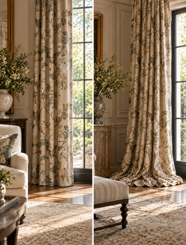
Because when drapery reaches the floor we actually have choices.
It can just kiss the floor.
It can break slightly.
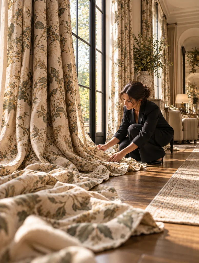
Or we can intentionally add extra fabric so it puddles onto the floor.
And YES, that changes the entire personality of the room.
A clean floor length drape can feel tailored and controlled.
Add extra length and suddenly you get this softer more romantic effect where the fabric gathers at the bottom.
Beautiful.
BUT here’s the part Instagram doesn’t have to live with.
YOU DO.
Fabric sitting on the floor can collect dust.
The puddle has to be arranged.
Pets may decide you created a very expensive new bed specifically for them.
And if these are curtains you’re opening and closing every single day, that extra fabric has to go somewhere every time they move.
So this isn’t simply, “Which picture do you like?”
Designers are thinking about the fabric itself.
How it drapes.
How formal the room should feel.
Whether the panels are stationary or functional.
Who’s living there.
And how much maintenance that person is ACTUALLY willing to do.
Because I can give you the most romantic puddled drapery in the world.
But if you’re going to curse my name every time the Roomba eats it, it was not the right choice for YOU.
Sometimes the prettiest option is the one that works with the way you actually live.
Caption
The curtain puddle is beautiful UNTIL the dog is sleeping on it and the Roomba has declared war 😂 This is why designers don’t make decisions from a pretty photo alone. How you actually LIVE with something matters.
@interiordesigncommunity #idcvideo #windowtreatments #curtains #interiordesign
Assets
Press and hold any image on your phone to save it to your camera roll.
5. The Case for Something Old
Hook: Sometimes the thing a brand new room is missing might be something OLD.
You can have beautiful new furniture.
Fresh paint.
Perfect lighting.
A gorgeous rug.
And somehow the room still feels a little TOO perfect.
Like everything arrived Tuesday.
This is where something old can completely change the conversation.
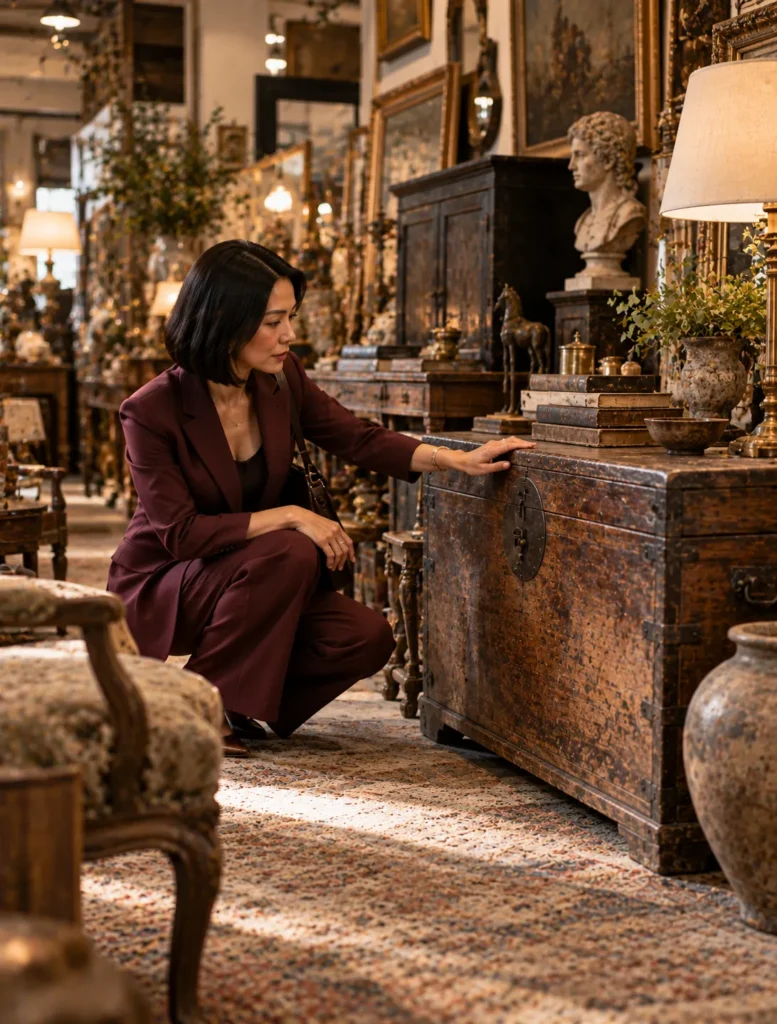
Maybe it’s an antique chest.
A vintage chair.
An old painting.
A weird little object you found at an estate sale and have absolutely no idea what it was originally used for.
THOSE pieces bring something into the room that you cannot manufacture instantly.
History.
Wear.
Patina.
Evidence that the object had a life before it got there.
And designers can use that contrast intentionally.
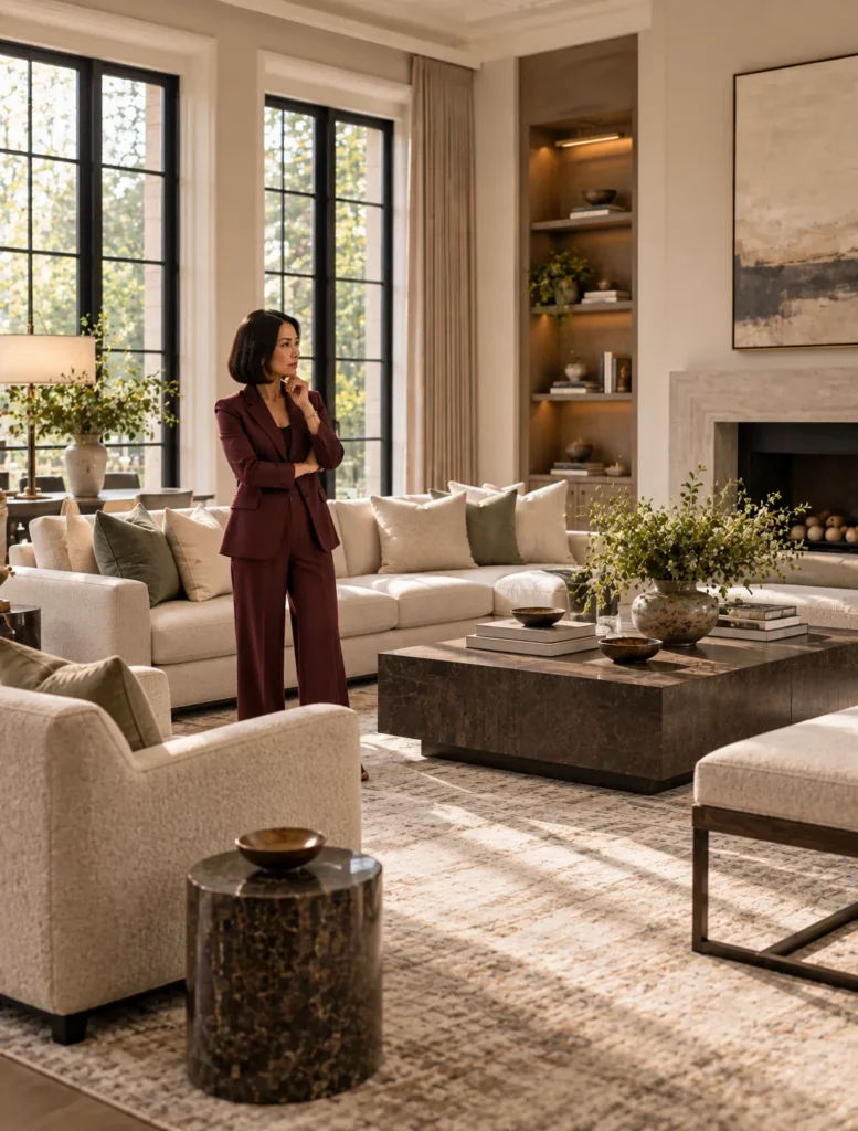
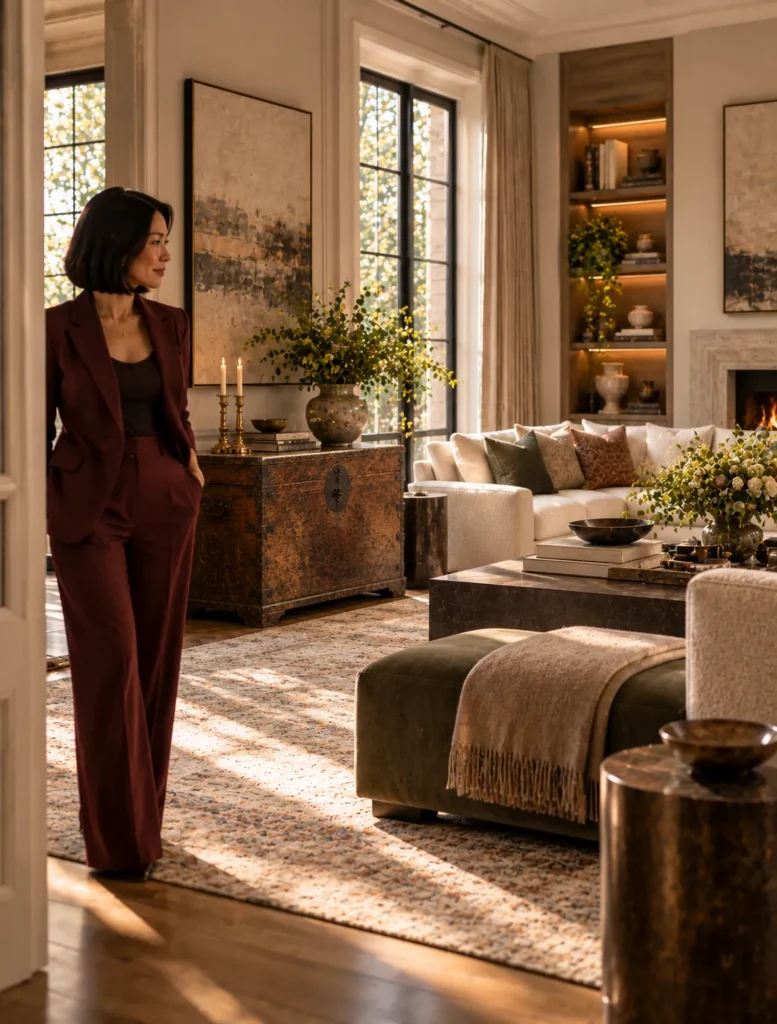
Put an old wood chest with a worn finish into a very clean contemporary room and suddenly both things become more interesting.
The new pieces make you notice the age of the chest.
The chest keeps the new room from feeling like it came straight out of one catalog.
And here’s what I REALLY love.
The old thing doesn’t necessarily need to be expensive or historically important.
Sometimes it has value because it belonged to your grandmother.
Or because you found it traveling.
Or because you saw it in some dusty little antique shop and could NOT stop thinking about it.
Those pieces give us somewhere to start telling YOUR story.
Because we’re not designing a showroom.
We’re designing a home.
And homes SHOULD look like somebody has actually lived a life before the delivery truck showed up.
Caption
Sometimes a brand new room needs something with a little HISTORY! An antique, vintage piece, family object or weird estate sale find can bring in the patina and personality that you just can’t order overnight.
What’s something old you love in YOUR home?
@interiordesigncommunity #idcvideo #vintagedecor #antiques #interiordesign
Assets
Press and hold any image on your phone to save it to your camera roll.
6. What Is Bookmatching?
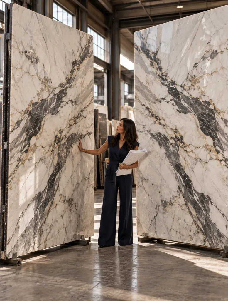
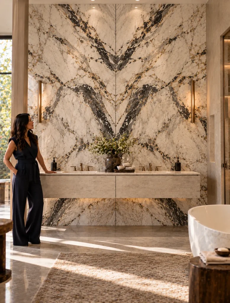
Hook: This wall might look like ONE giant piece of stone…but somebody actually planned exactly where to CUT it.
And THIS is one of my favorite details to point out because once you notice it you can’t unsee it.
It’s called bookmatching.
Imagine opening a book.
The left page and right page mirror each other around the center.
We can create that same visual effect with materials that have natural movement or pattern.
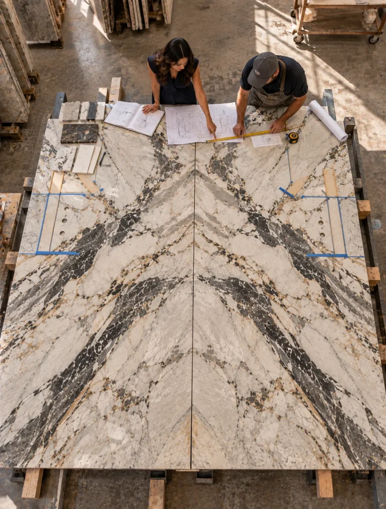
With stone, for example, slabs can be cut and positioned so the veining on one side visually mirrors the veining on the other.
Suddenly that natural pattern becomes this huge dramatic composition.
But here’s what people don’t see.
That effect doesn’t just magically appear after installation.
We have to know what the actual slabs look like.
Where the important veining is.
How large the finished surface is.
Where seams, corners, sinks, outlets, faucets, or other interruptions are going to land.
Because imagine finding the PERFECT dramatic vein…
and then realizing we planned an outlet directly through the middle of it.
NO.
This is why designers may review slab layouts or work with fabricators before anything gets cut.
We’re thinking about the material as one complete composition, not just individual pieces being installed next to each other.
And bookmatching isn’t limited to stone.
You’ll also see the idea used with wood veneer and other patterned materials.
So the next time you see a gorgeous marble wall where the veining seems to unfold across the surface like a Rorschach test…
somebody planned that.
Caption
That dramatic stone wall did NOT just happen… Bookmatching turns the natural movement in a material into part of the composition which means we’re thinking about seams, veining, fixtures and cuts BEFORE installation.
Once you know what bookmatching looks like you’re going to spot it everywhere.
@interiordesigncommunity #idcvideo #bookmatching #stonedesign #interiordesigntips
Assets
Press and hold any image on your phone to save it to your camera roll.
7. Why Designers Specify Taylor King · Taylor King
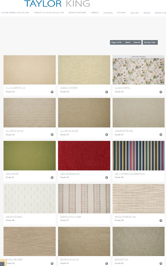
Hook: There can be more than 1,600 fabric choices for ONE piece of furniture and that’s BEFORE we start changing the furniture itself.
Welcome to custom upholstery.
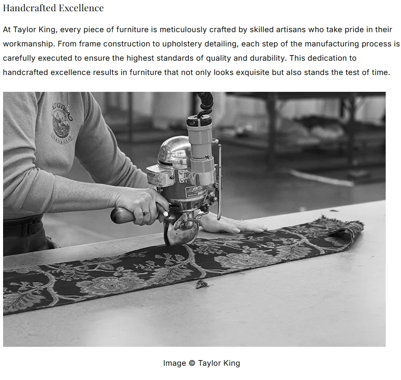
Taylor King makes custom upholstered furniture in North Carolina and this is a really good example of why specifying furniture can get a whole lot more complicated than picking the sofa you like in a picture.
Because first we have the FRAME.
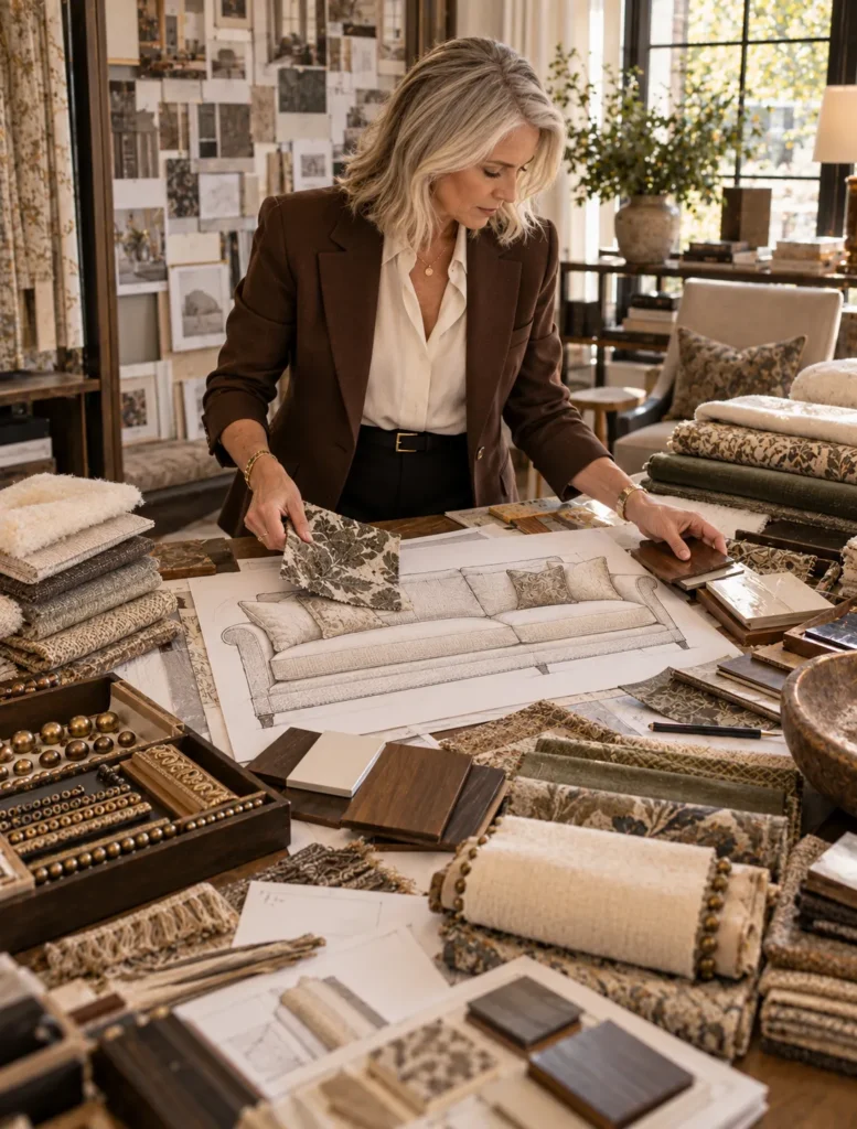
Then we have more than 1,600 fabrics.
More than 100 leathers.
Trims.
Wood finishes.
Different cushion options.
And many pieces can even be customized in dimensions like depth, height, or length.
Now imagine making all of those decisions for YOUR room.
We’re not choosing a fabric just because it’s pretty.
We’re thinking about how it’s going to perform.
What else is happening in the room.
How you actually like to SIT.
How deep the furniture can be without affecting circulation.
And if we’re using a pattern we’re thinking about how that pattern is going to land across the finished piece.
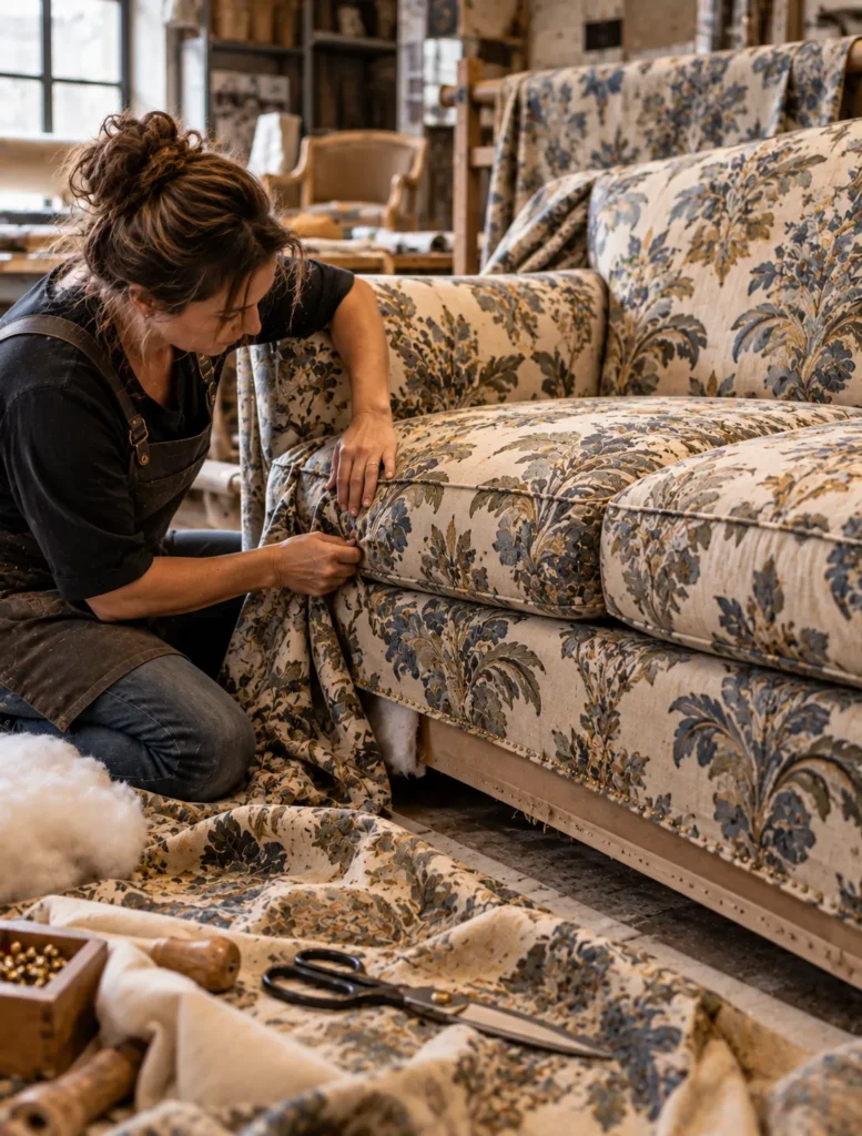
Taylor King actually uses what’s called a full flow match on patterned fabrics so the pattern continues across the upholstery instead of looking chopped up from one section to another.
THAT is the kind of craftsmanship you might never consciously notice when it’s done correctly.
You just look at the finished piece and think…that looks RIGHT.
And Taylor King upholsters each frame one piece at a time by one craftsperson.
So when designers specify custom upholstery, we’re not trying to find a sofa and force your room to work around it.
We’re making all of these tiny decisions so the finished piece works for the ROOM and the people who actually live there.
Caption
1,600+ fabrics and we haven’t even gotten to the leathers, trims, finishes, cushions OR custom sizing😅
This is why custom upholstery is a whole different design process. With Taylor King we’re able to make the little decisions that turn a piece of furniture into the RIGHT piece for the room.
@taylorkingfurniture @interiordesigncommunity #idcvideo #taylorking #customupholstery #interiordesign
Assets
Press and hold any image on your phone to save it to your camera roll.
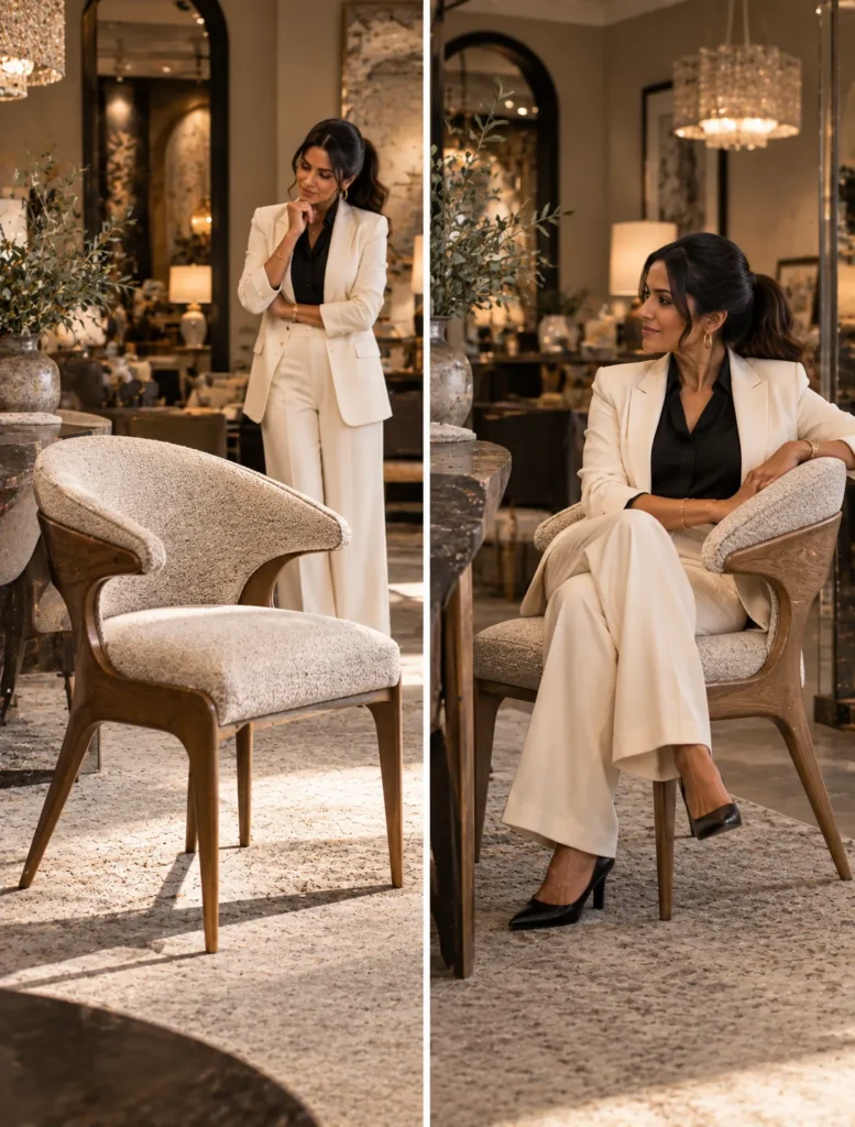
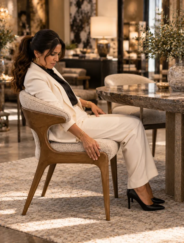
8. The Chair Test
Hook: You should NEVER choose a dining chair without imagining yourself trapped in it for THREE HOURS.
Because dining chairs have one of the sneakiest jobs in the house.
They have to look beautiful sitting around the table when nobody is there.
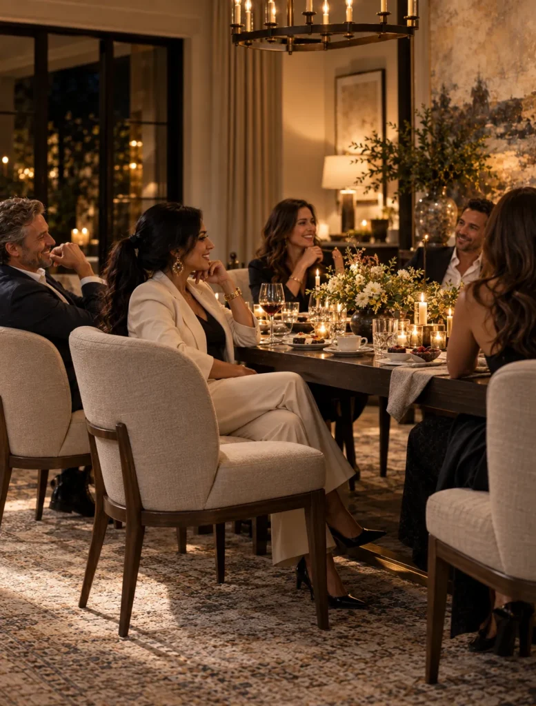
But then Thanksgiving happens.
Or a dinner party.
Or somebody opens another bottle of wine and suddenly dinner has lasted until midnight.
NOW that chair has to actually perform.
And designers are thinking about a whole lot more than whether the fabric is pretty.
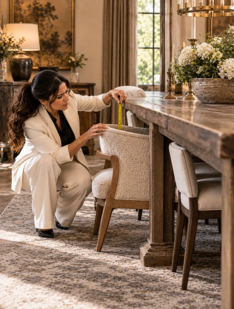
First, does the seat height actually work with the dining table?
You need enough space between the seat and the underside of the table to sit comfortably.
Then we’re looking at width.
Depth.
The angle of the back.
Whether there are arms and whether those arms can actually clear the table apron.
Because there is nothing more annoying than a chair that LOOKS like it should tuck under the table…
and doesn’t.
Then we have to think about how many chairs need to fit around that table WITHOUT everybody knocking elbows.
And THEN comes the fabric.
Do you have kids?
Pets?
People who cannot be trusted with red wine?
Maybe we need a performance fabric.
Maybe leather makes sense.
Maybe that gorgeous delicate textile should live somewhere people aren’t eating spaghetti.
This is what I mean when I say designers are constantly balancing beauty with function.
The chair has to look right.
The proportions have to work.
It has to physically fit.
AND you have to want to keep sitting in it after dessert arrives.
THAT is the dining chair test.
Caption
A dining chair has to pass the DINNER PARTY TEST 🍷 It can be gorgeous but if you’re uncomfortable before dessert or the arms won’t tuck under the table…we have failed!
Design is ALWAYS beauty AND how you’re actually going to use the thing.
@interiordesigncommunity #idcvideo #diningchairs #diningroomdesign #interiordesigntips
Assets
Press and hold any image on your phone to save it to your camera roll.
9. Inside Leftbank Art · Leftbank Art
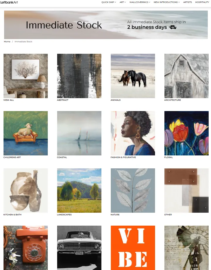
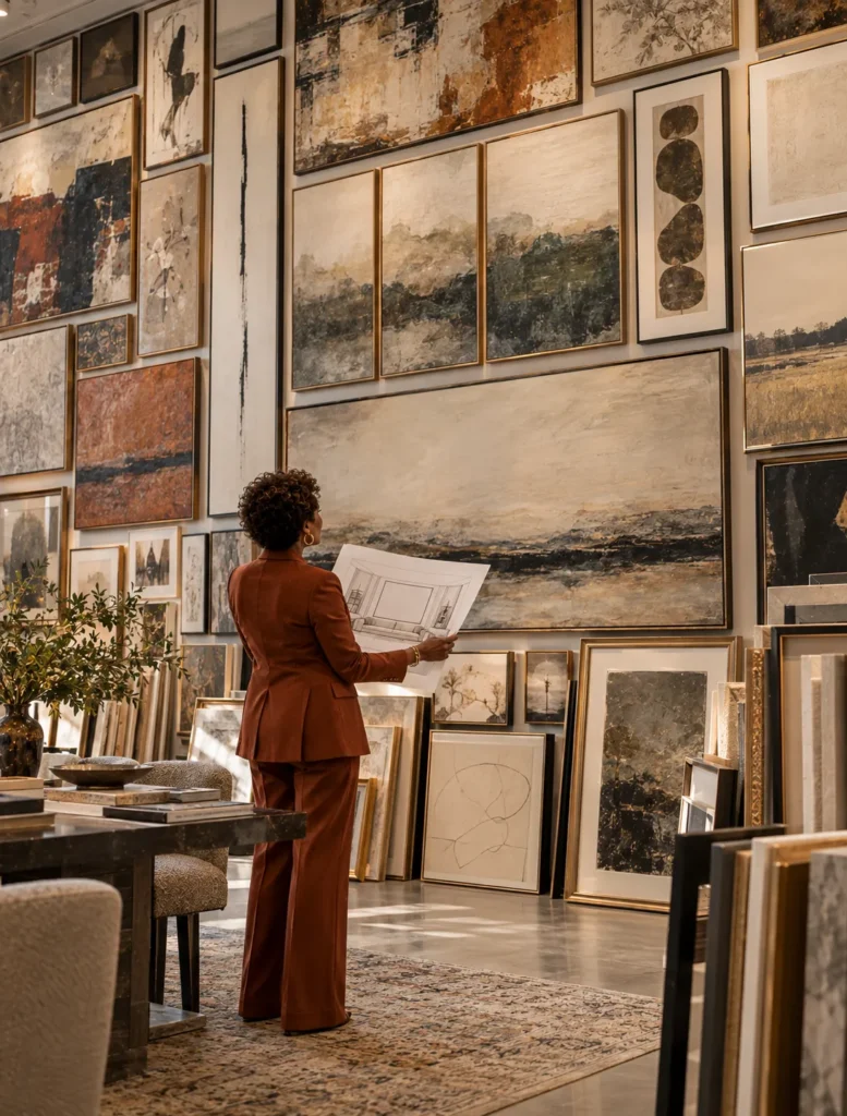
Hook: Imagine trying to find ONE piece of art in a collection of more than 30,000 designs.
THAT sounds overwhelming.
But for an interior designer, having that kind of range can actually solve a very specific problem.
Because we’re rarely just shopping for “a pretty picture.”
We’re looking for art that has to work with a ROOM.
Scale matters.
Orientation matters.
Color matters.
The frame matters.
Sometimes we need one enormous statement piece.
Sometimes we need several pieces that relate to each other without looking like we bought a matching set.
And this is why I think Leftbank Art is interesting from a designer’s perspective.
They’ve been around for more than 50 years, and their pieces are handcrafted in the USA.
But the part I really want consumers to understand is what access to a huge art resource does for the DESIGN PROCESS.
If I need something vertical for a narrow wall, that immediately changes the search.
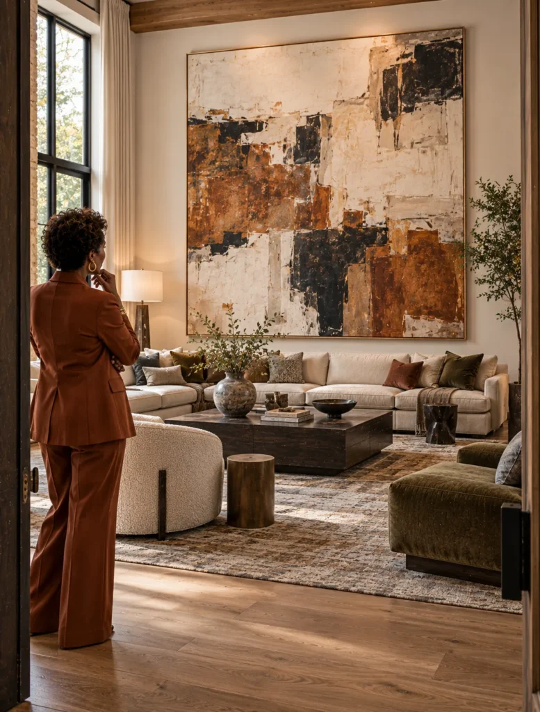
If I’m working with a giant wall over a sectional, scale becomes a completely different problem.
And sometimes we find the right IMAGE but need to think about how it’s finished or sized for the space.
That’s where having customization options becomes incredibly useful.
This is also why designers don’t always start art shopping by saying, “What painting do I like?”
We’re asking what this particular WALL needs to do for the entire room.
Does it need height?
Color?
Contrast?
Quiet?
A focal point?
Art isn’t the thing we throw onto the wall because we finished decorating and there was an empty spot left.
When we plan it correctly, it’s part of the architecture of the room.
And having THOUSANDS of possibilities is a lot less scary when you know exactly what you’re looking for.
Caption
30,000+ designs sounds like a LOT until you realize how specific an art search can become. Size, orientation, color, framing, scale, the furniture underneath it…we’re not just looking for a pretty picture.
Leftbank Art has been creating handcrafted art in the USA for more than 50 years, with a huge collection and customization options that give designers a LOT to work with.
@leftbankart @interiordesigncommunity #idcvideo #leftbankart #artforinteriors #interiordesign
Assets
Press and hold any image on your phone to save it to your camera roll.
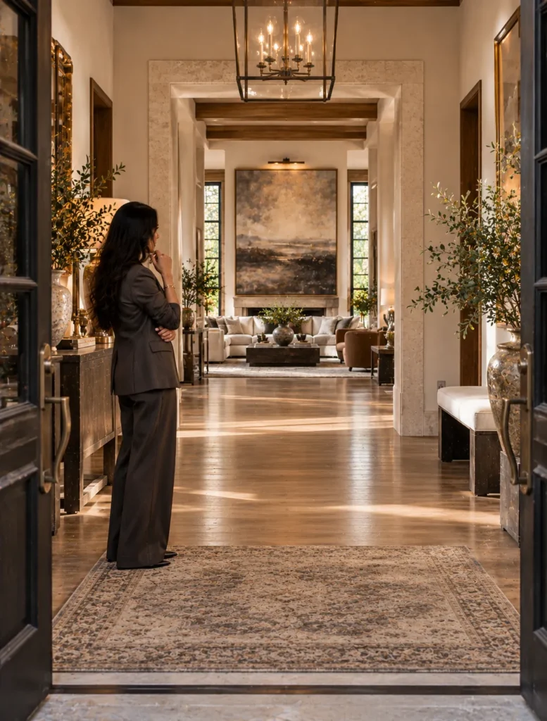
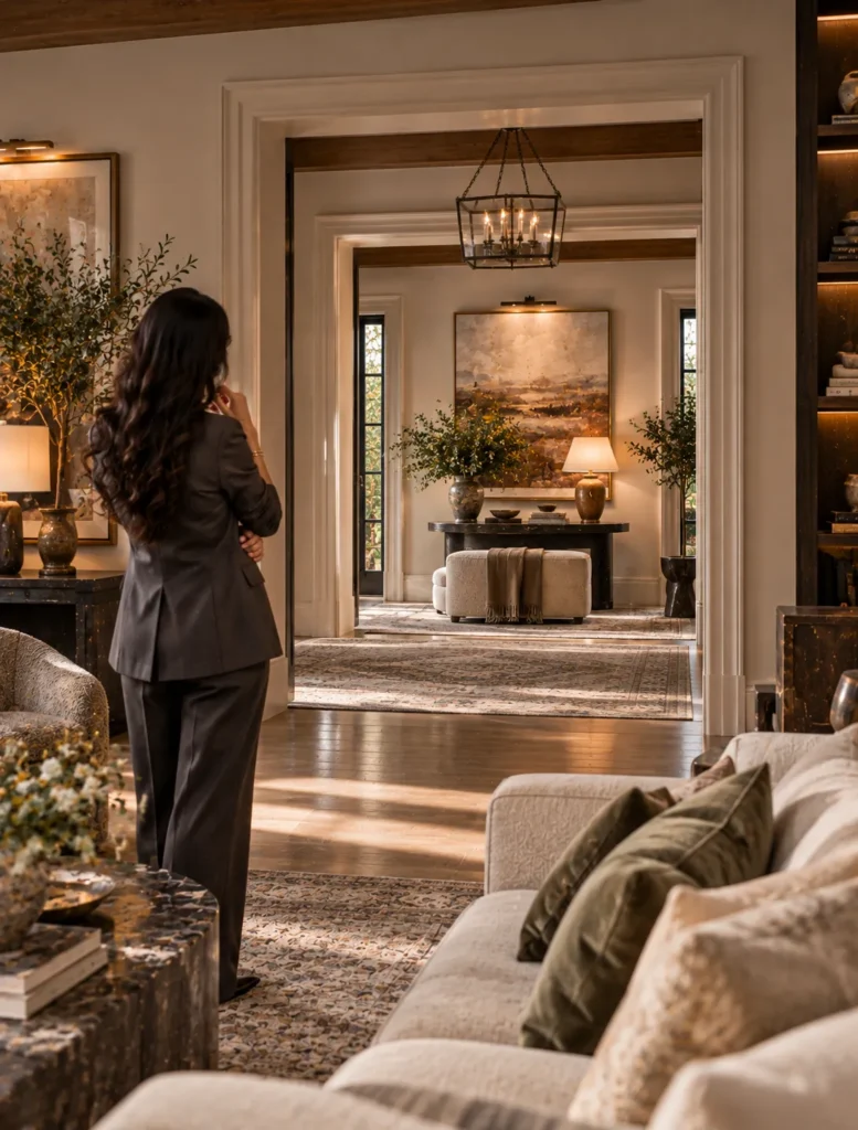
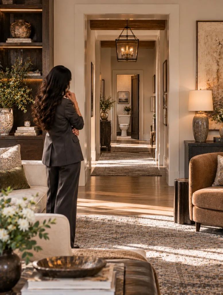
10. Why Designers Use Sightlines
Hook: Have you ever stood in one room and noticed your eye is immediately drawn to something in ANOTHER room? That’s a sightline.
A sightline is basically the view you have from one point in your home to another.
And designers think about these ALL the time.
Stand at your front door.
What can you see?
Now stand in your kitchen and look through the doorway.
Walk down your hallway.
What’s directly at the end of it?
THOSE are sightlines.
And they matter because your eye doesn’t stop designing a room just because you walked out of it.
If I know you can see straight through the foyer into the living room, I might intentionally place a beautiful piece of art where your eye naturally lands.
If a long hallway ends at a blank wall, that wall suddenly becomes pretty important.
Maybe that’s where we use art.
Wallpaper.
An interesting light fixture.
Or a beautiful piece of furniture.
But sightlines also help us catch things we DON’T want to emphasize.
Maybe you can see directly into a bathroom from the dining room.
Maybe the first thing you see when you open the front door is the side of the refrigerator.
Maybe the back of a sofa is blocking a beautiful fireplace from the next room.
Those are things we want to know BEFORE we start placing furniture.
This is why designers don’t just stand in the middle of a room and design what we see from there.
We walk through the house.
We stand in doorways.
We look down hallways.
We pay attention to what gets revealed as you move from one space into another.
Because we’re not just designing individual rooms.
We’re designing how you EXPERIENCE the house as you move through it.
And sometimes the most important view of a room isn’t even from inside that room.
Caption
A sightline is the view from one part of your home into another and once you start looking for them, you see them EVERYWHERE. 👀
Design doesn’t stop at the doorway. What does your eye land on when you walk into your home?
#interiordesigncommunity #interiordesign #sightlines #designtips
Assets
Press and hold any image on your phone to save it to your camera roll.
Stuck on any of these?
Bring it to office hours, Tuesday at 12:00pm ET, or submit a question ahead of time on the hub.